

Branding package for The Stuff Lab
This new, home organization business needed an identity that represented their mission to help supply order to their client’s lives. The logo features clean lines, with letters mimicking neatly stacked items on shelves. The pointed roof was echoed graphically on the business cards, simultaneously serving as a directional element to support the tag line “Toward a more organized home.”

Logo design for Brackett School
The Brackett Elementary School is a close-knit, K-5 school in Arlington, MA. Two major architectural features on the school building are the painted, rainbow arch over the main entryway and the cricket weathervane on the top of the building. This logo design incorporates both architectural elements and is featured on hats, bags, stationery and signage.

Art Friday flyers for Brackett School
The PTO-run Art Squad at Brackett Elementary School organizes monthly art workshops for students and their families. An Art Friday logo was created to easily recognize and identify the Friday event series, and an 8.5x11 flyer template was designed to be able to plug in details with a changing background image or texture, providing a hint at the theme of that month’s art project.

MassArt portfolio piece:
event collateral
The challenge for this project was to design an identity, poster, invitation, brochure and tickets for a fictional poetry festival. The concept behind the pieces is a play on the 5-7-5 structure of a haiku poem and is shown graphically through the series of dots in the logo, through birds perched on a wire and through birds in flight.
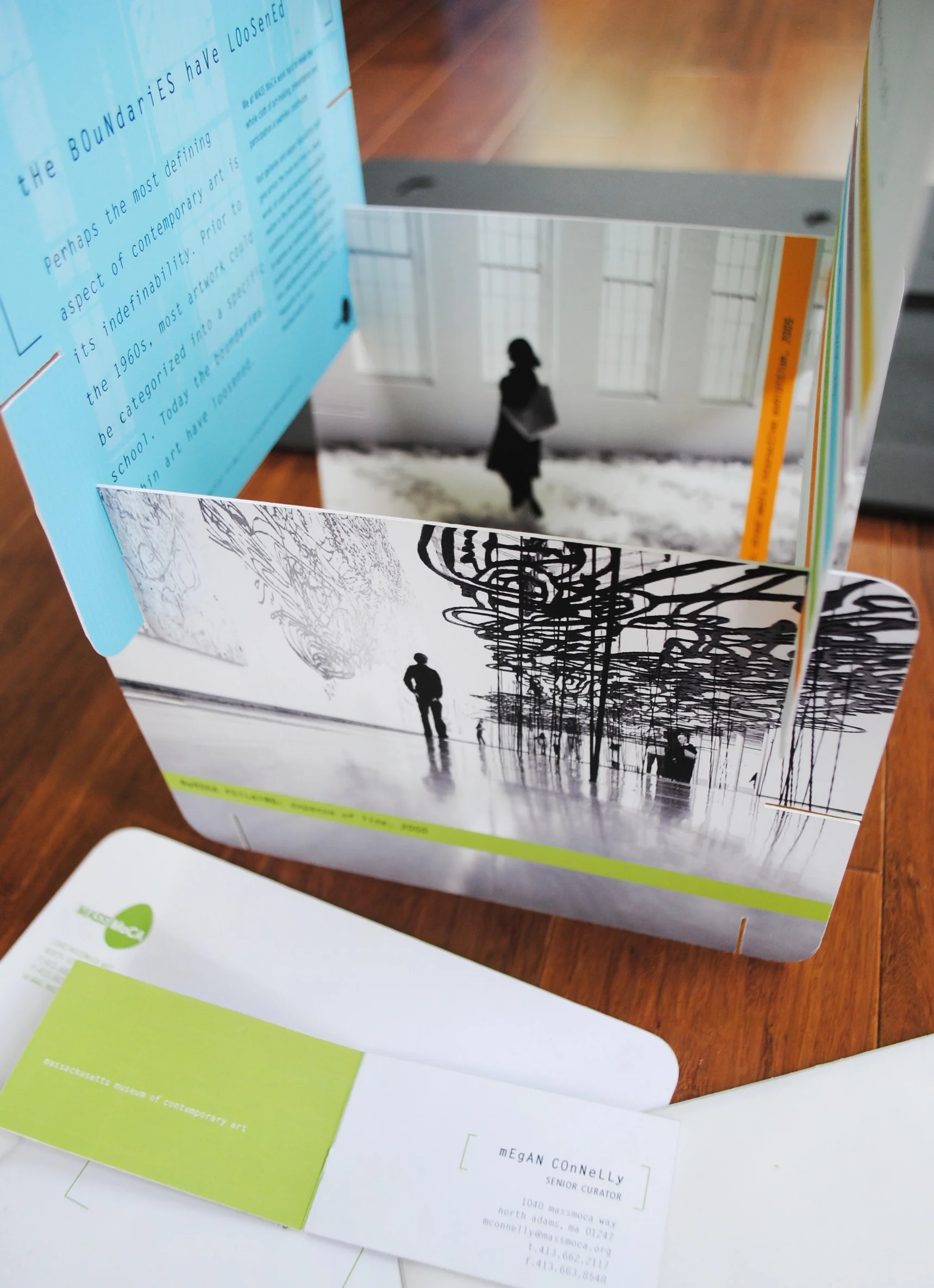
MassArt portfolio piece:
museum branding and mailer
The branding concept for the Massachusetts Museum of Contemporary Art (Mass MoCA) focuses on the idea of openness - both the openness of space that exists in their vast, industrial spaces, and the openness of the mind and creative process that the museum exposes - as well as the idea of Mass MoCA serving as an incubator of ideas and art. I show both of these concepts visually through the egg-shaped form (incubator of ideas) in the logo and the concept of openness through letter and line spacing, the wide and loose bracket typographic element, negative space, and vellum. These identity tools were used throughout the pieces.
The mailer is a brochure that also serves as a make-your-own sculpture. Each card has notches that allow you to stack other cards vertically or horizontally and feature a black and white image from the museum on one side, and text and texture on the reverse side. Subsequent mailers would be designed to fit previous ones.

MassArt portfolio piece:
retail branding and stationery
Here I created a fictional shoe company called Oleander: dangerously beautiful shoes. Oleander blooms are vibrant but highly toxic. Playing off of that dichotomy, I used my own photography, urban background textures, and saturated colors, to create a slick and edgy brand. The paper I chose for the pocket folder was high gloss, with a contrasting matte paper for the brochure and stationery.

MassArt portfolio piece:
conference poster and invitation
In designing the concept for the call for entries poster and invitation for the Innovative Systems of the Future Conference, I used abstract images of light to show movement, energy and temperature. The paper I chose was a light grey, slightly textured recycled stock that softened the edges of the graphics.

Holiday card for C7A
For Cambridge Seven Associates (C7A), an architecture and exhibit design firm in Cambridge, MA, I designed this typographic and bold holiday card. Playing off of their red corporate color and the number ‘7’, the graphic result is both festive and playful.